
At the time of this publication, the Samsung Galaxy Z Fold3 has been on the market for nearly half a year. Be that as it may, I think that there’s still time for me to talk about my experience with this foldable device and what it’s actually like to live with on a day-to-day basis.
This review comes a little late, so without further ado, let’s get right into it.
Specifications
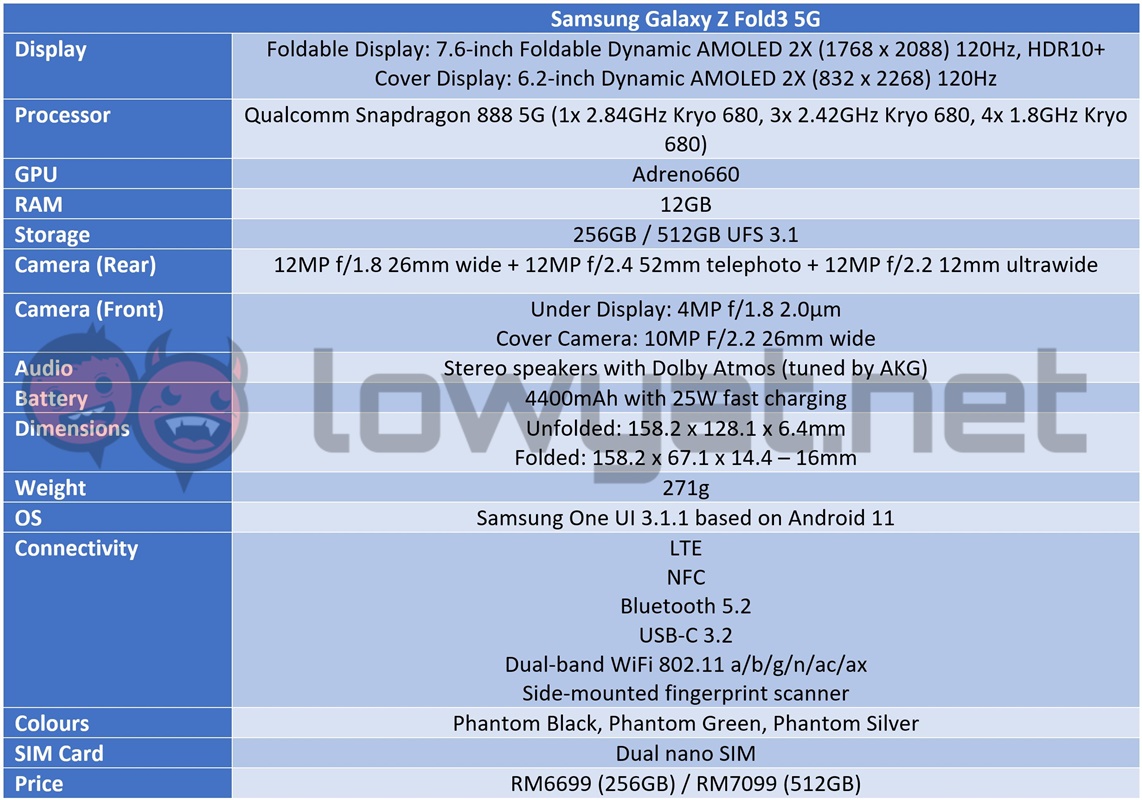
Design
If you’re jumping up from the Z Fold2, you aren’t missing that much. While it may look identical to the Galaxy Z Fold2, the Z Fold3 does come with some tweaks to its design. To start, Samsung has added in some extra nubs and stubs into the nooks and crannies of the phone, making it one of Samsung’s first-ever foldable phones with an IPX8 rating, allowing the phone to be submerged underwater at a depth of 1.5m, for a period of 30 minutes.
In addition to the water-proofing, The foldable display is also technically now two panels, split right down the middle of the phone, literally. The change is, from a design standpoint. boils down to efficiency. At least, that’s what Samsung has said. Having said that, it’s definitely an improvement over the critical hiccup that plagued the foldable display panel of the original Fold.
Yes, that crease in the middle is still there. Deal with it.
With that, the one feature or blemish, depending on how you see it, the folding crease, is still there. Safe to say, it never left but it is effectively a defining aspect of the Z Fold3 and its predecessors, so until Samsung or another smartphone brand develops a flexible panel that eliminates the existence of said crease in the foreseeable future, there is little choice for us in the matter.
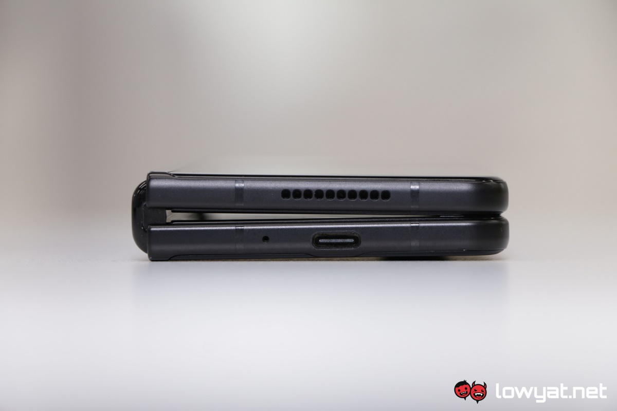
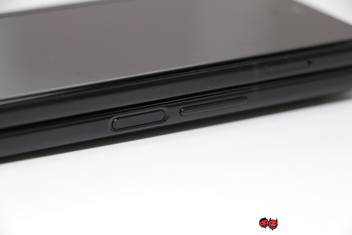
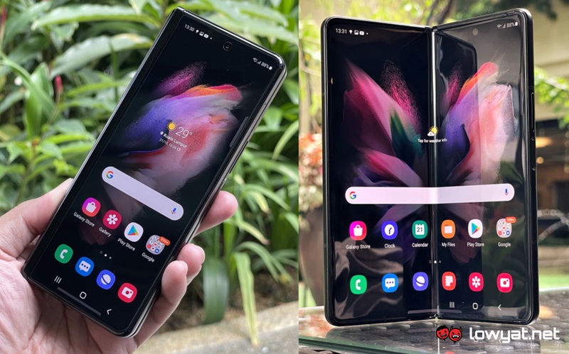
Moving on, when folded, the Z Fold3 is still the same thick and tall device, complete with the same narrow display at the front and the aluminium chassis that covers the back. Again, like predecessors, the phone doesn’t actually fold completely flat and there is a bit of a gap between the two components, closer to the device’s hinge. Unfold it, and the phone’s overall thickness reduces from 16mm to just 6.4mm, but doesn’t sit entirely flat on the table, due in part to small bump from the main camera module. Of course, you’re shifting from 6.2-inches to the larger 7.6-inch flexible display, so no love lost there.
Returning back to the displays, both the cover panel and foldable display are still capable of running at 120Hz, while the foldable display now has an under-display selfie sensor, instead of the more blatant punch-hole camera sensor used on the Z Fold2, but that isn’t to say the new feature is without sin. More on that later. Beyond that, you get the usual creature comforts, including Dolby Atmos support, the top-tier Snapdragon 888 SoC, and a whopping 12GB RAM.
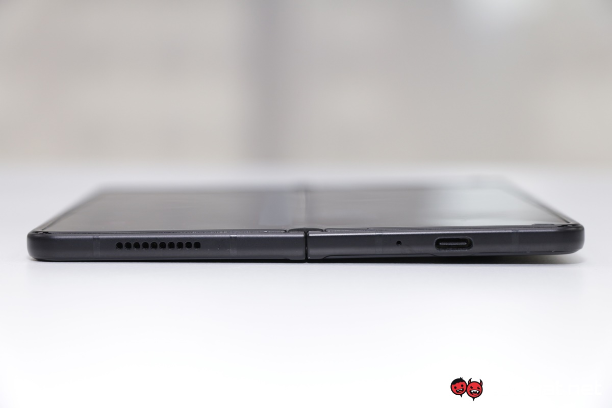
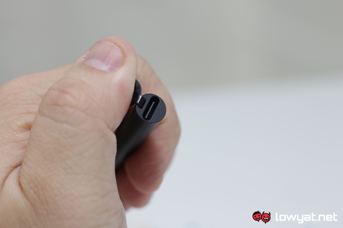
Beyond that, and as mentioned, much of the other physical features are carry-overs from the Z Fold2. The USB-C port is still located at the base of the right slate. Another piece of good news for me, though, is that Samsung actually provided me with an S Pen Pro to use together with the foldable. It’s a nice gesture by Samsung, for the simple fact that this accessory is sold separate from the phone and as you can imagine, you need to be prepared to fork out an additional RM499 for the pencil-sized stylus, on top of the Z Fold3’s steep starting price of RM6699.
That, and the fact that the phone doesn’t even have a dedicated or integrated slot for the S Pen Pro. but more on that later.
User Experience
Let’s start by talking about the phone from a day-to-day perspective. In contrast the standard, non-foldable smartphone, the Z Fold3 is, for lack of a better word, clunky. Honestly, it’s a lot heavier than the average smartphone, weighing in at 271g, and just putting it inside my pockets begins a slow process of dragging my pants down to the floor.
Unfolding it isn’t as simple as it looks.
Then there’s the transformation process from opening it up whenever you need access to the larger screen real estate. I’ll give the Z Fold3 this: it’s a solid piece of mechanical engineering and given how often I find myself switching over from phone to tablet mode, it makes sense that Samsung would want to make the hinges as rigid as scientifically possible. That said, opening it up does require a considerable amount of effort on my part, and once it’s open, the hinges lock themselves in place for the duration. Having said that, folding up the device is actually a lot easier than it looks and simply requires a firm push into the middle of the two slates, quite literally.
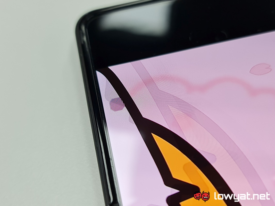
Of course, it is difficult to speak about the Z Fold3’s foldable display without even talking about the under-display camera sensor. With the punch hole selfie camera of the Z Fold2, the physical feature simply presented itself as a black spot at the corner of the eye; a feature that I’ve learned to blot out over time. With the Z Fold3, that sadly isn’t the case. Technically speaking, the under-display camera isn’t entirely hidden away from sight; if the background around the module is bright or white, it masks itself by creating a screendoor effect by making the multiple embedded LEDs illuminate at the current brightness level I’ve set for the display.
That effect doesn’t help to mask its presence and if I’m honest, draws attention to it. It’s jarring and more often than not, it’s irritating, stealing my glances whenever said bright or white backgrounds are presented in a momentary flash.
Look beyond the flaws, though, and my experience with the Z Fold3 is what I have come to expect from a love child between a phone and tablet. I love the extra screen space the foldable provides whenever I want to watch my movies or YouTube videos but above all else, that extra space also means I have a better grip on the device while typing out a message that I am either sending out for work or on social media. Small side note here: the default Samsung keyboard is split-style, in order to accommodate for the gap caused by the screen. Personally, I’m fine with my thumbs reaching over to punch in the relevant alphabet or symbol with GBoard, but that’s just a personal preference.
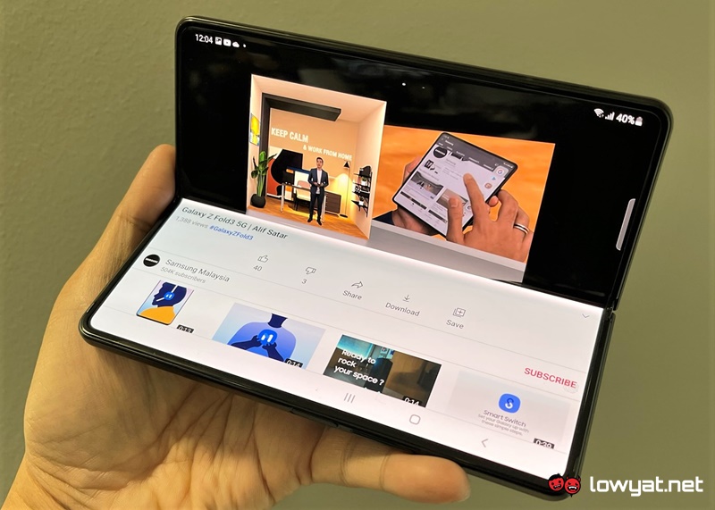
Flex Mode is such a convenient feature.
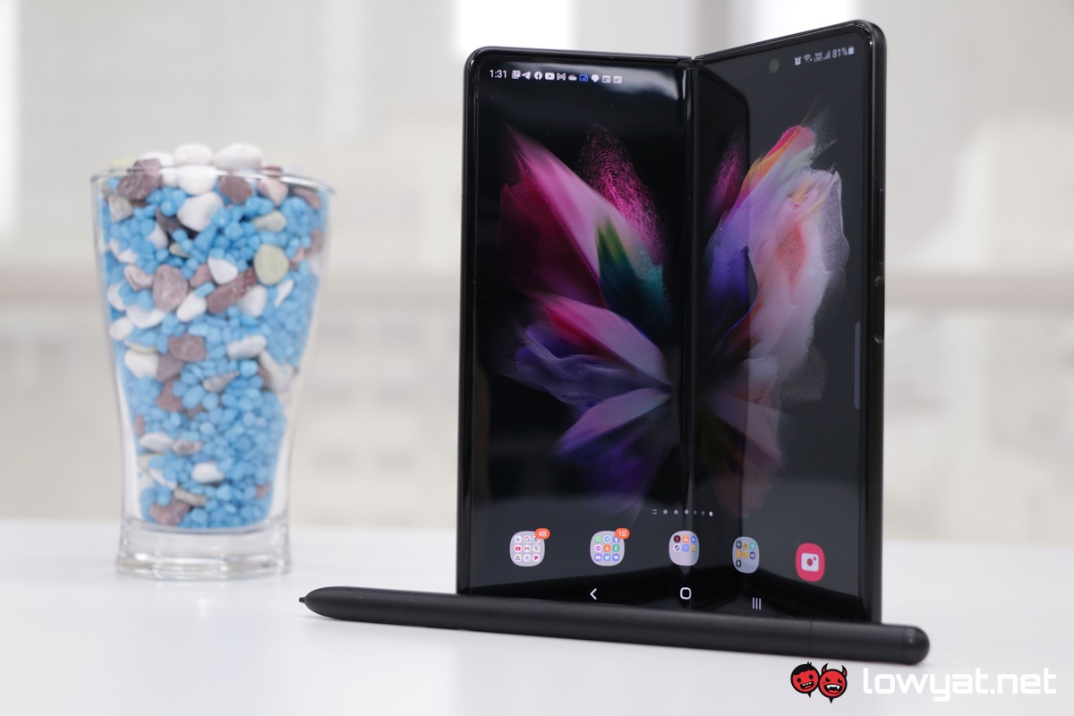
Another physical feature that I find myself often using with the Z Fold3 is Flex Mode. I know, it’s not a new feature by any measure of the word, but ultimately, the feature is such a convenience, specifically when I’m having lunch and want a video to keep me company for the duration of my meal. That I can simply fold the Z Fold3 at an angle and set it down on the table, without the need of a third-party accessory to do it. However, and once again, not all apps play nice with Flex Mode but as it happens, you can fix that by simply accessing the Settings.
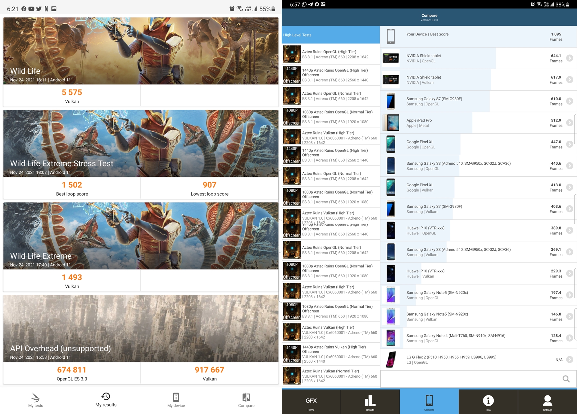
From a gaming standpoint, it goes without saying that the Z Fold3 manages to effortlessly run all of today’s available mobile game titles. As with other Samsung flagship, the Game Booster feature is present, and almost all games fill out the display nicely. I say almost because certain titles are designed to be played in portrait mode. For another matter, the phone and its Snapdragon 888 do a great job in managing the amount of heat generated. To be even more precise, the heat seems to be isolated at the top half of the right chassis.
Where the Z Fold3 stands out as a foldable phone, though, is with its multitasking capabilities. As you know, the phone does give access to the multi-window feature that is activated by the “Drag-and-Split” function that snaps your content or app of choice to the half you drag it into. It’s a useful feature to have around, especially when I want to read a news piece while monitoring my chat activity simultaneously. That said, I think the function that I find myself actively using is the Multi-Active Window function that is part and parcel of Samsung’s One UI.
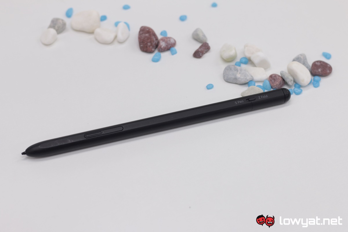
The S Pen Pro is a great, even necessary tool.
Then there’s the S Pen Pro. As an accessory, there isn’t really anything that is inherently bad and frankly, once I began using it, I quickly discovered that I couldn’t live without it. Unlike the thin, near toothpick-sized S Pens that are part and parcel of the Galaxy Note series, being able to properly hold the pencil-sized stylus is so much more comfortable and allows me a greater degree of control whenever I needed to jot down notes. As a side effect, my handwriting looks less like chicken tracks and clearly more readable, even to myself. In all fairness, though, the extra display real estate provided by the foldable, along with the slightly larger space to rest my palms, also played a role in that improvement.
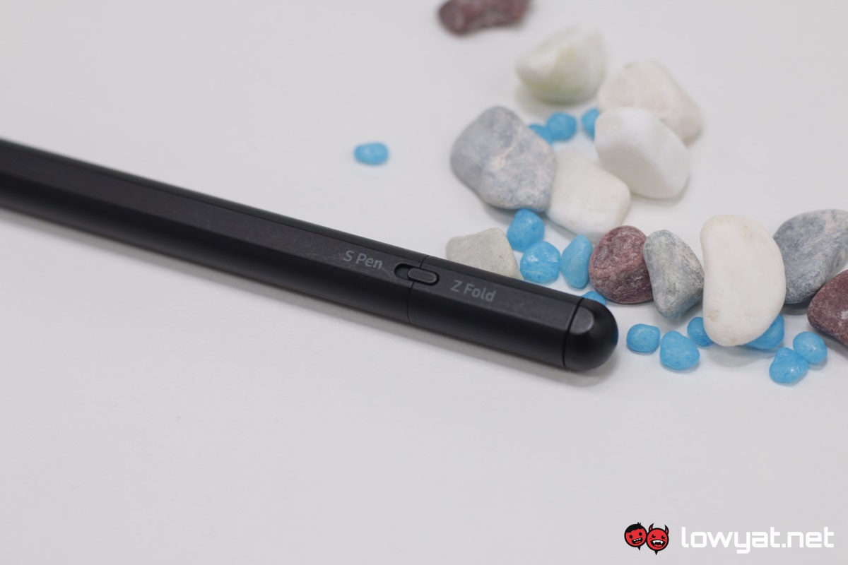
On that note, the tip of the stylus is pressure-sensitive and designed specifically for the Z Fold3. Because of the foldable display’s slightly more fragile nature, the tip of the S Pen Pro pushes back into the pen whenever pressure is applied while writing; the function not only allows users to control the amount of pressure they wish to exert while writing or drawing, but also to protect the panel from being punctured or damaged from excessive force. Having said all that, one small little point I need to make: if you’re planning on getting the S Pen Pro with the Z Fold3, please spend the extra Ringgit for one of the compatible phone cases that will allow you to attach the stylus to it.
The Z Fold3 with 120Hz activated makes battery consumption terribly inefficient.
Moving on, there’s the battery endurance or lack thereof. Running the display with the motion smoothness set at 120Hz absolutely knackers the battery life and drains it like a man who hasn’t had a drop of water after a year in a desert. Using it on a daily basis, the battery would go from 100% to single digits in just half a day, and that’s just from using it for the usual activities, including checking emails, checking social media platforms, replying to messages, answering calls, as well as the occasional video from either YouTube or Netflix. To that end, binge-watching my favourite series on the streaming service saw the battery on the Z Fold3 go from 100% to near zero in just over four hours which is, by today’s standards, unacceptable for a flagship.
Reducing the motion smoothness effect down to the standard 60Hz significantly improves the Z Fold3’s battery life and the switch is immediate. Fully charged, I am able to get a little more than a full day of use on average and the number of hours that the phone clocks in during my binge-watching doubles to eight hours, which definitely feels more in line for a phone of this calibre.
Camera
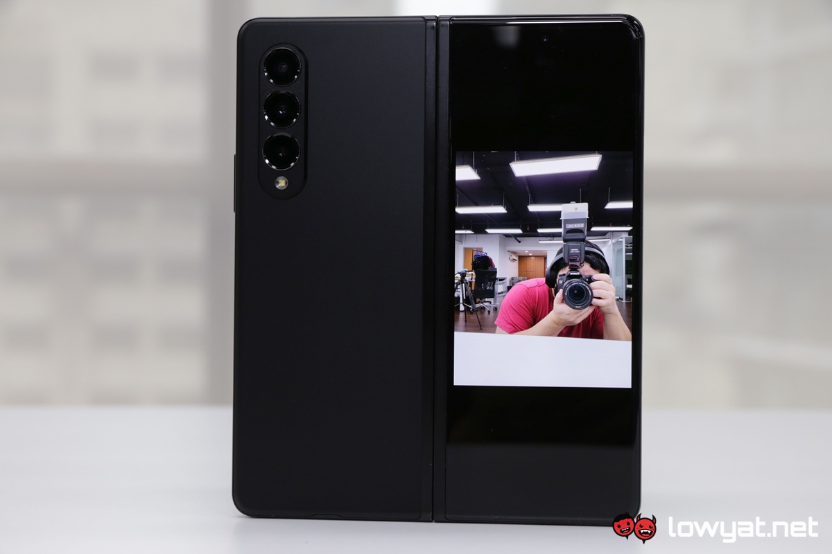
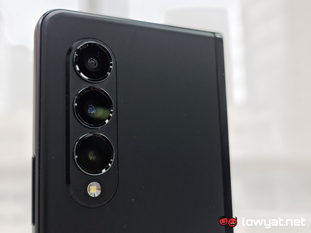
Let’s talk about the Z Fold3’s performance in the photography department. Unlike the Galaxy Note20 Ultra and or S21 Ultra’s massive 108MP sensors, Samsung decided to dumb it down with the main triple-camera module and simply use a uniform 12MP sensor across the board. That includes the wide, utlra-wide, and telephoto lenses.
As for its performance, the final results from pictures I’ve taken are reminiscent of the picture quality of the older Galaxy Note10 Ultra that I had also reviewed previously. That, and the fact that the camera isn’t constantly plagued by a perpetual bokeh effect that seemed to be the default with the Note20 Ultra 5G. In any case, the camera’s low-light performance isn’t too shabby and the level of noise in most of the photos I have taken are minimal.
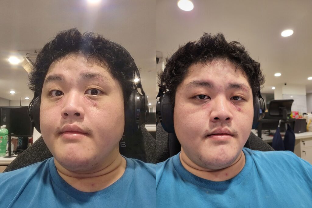
Sadly, I cannot say the same for the Z Fold3’s under-display camera. Despite the technology having been around for a while now, the end results are less than stellar. Even with ample lighting, selfies look washed out and slightly grainy. Honestly, you’re better off using either the 10MP sensor on the cover display or better yet, the main camera. Needless to say, the difference in quality is like the sun and moon.
Sample Images


Conclusion
As my title says, the Samsung Galaxy Z Fold3 isn’t so much a grand overhaul than it is the brand simply tweaking and making improvements in areas that it deems to be necessary. And while there is technically a competitor for it in the form of Huawei’s Mate X2, the Z Fold3 is in a class of its own, especially when you start to add up the features being offered on tap by Samsung.
The Samsung Galaxy Z Fold3 is the foldable phone its predecessor should have been.
At a starting price of RM6699, the Z Fold3 is also one of Samsung’s most expensive smartphones on the market, after its Galaxy Note series. Having said that, this lineup of foldable phones looks set to become the official replacement for the Note lineup, given the ongoing speculation of the Korean electronics giant’s alleged decision to pull the plug on the series.
That aside, if you’ve got the disposable income and willing to give this foldable phone a whirl, or even if you’re trading up from the first generation Fold or the Z Fold2, one point bears repeating: if you do plan on getting an S Pen Pro with the phone, do go the extra mile and purchase a casing with a compartment for the stylus too.
The post Samsung Galaxy Z Fold3 Review: More About Refinement Than A Major Overhaul appeared first on Lowyat.NET.


0 Commentaires