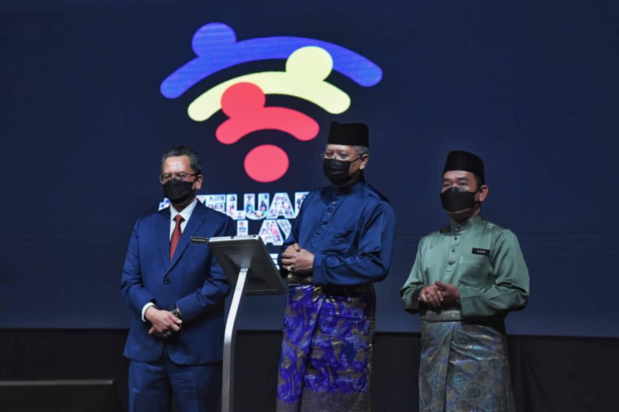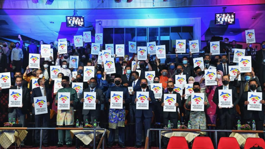
It is a long-time annual tradition for the Malaysian government to announce a theme and logo to kick off the Merdeka Day and Malaysia Day celebrations. For 2022, the unveiling by the Ministry of Communications and Multimedia (K-KOMM) took place earlier today.
In case you wondering whether the above logo for the 2022 Merdeka and Malaysia Day is real, I can assure you that it is absolutely the real deal. In case you feel that your eyes have completely deceived you, just take a look at the official manual released by K-KOMM right here [pdf].

While K-KOMM’s manual didn’t mention Wi-Fi’s name outright, the ministry did say that Internet network coverage is indeed the concept behind the logo. It supposedly represents the development of infrastructure and communication systems as well as the country’s rapid digitalization.

Not to forget, the manual also said that the logo’s arrangement depicts the openness among Malaysians in celebrating their differences and diversity in the name of mutual progress. Completing the logo set is the familiar Keluarga Malaysia iconography as well as the Teguh Bersama slogan which has been chosen as this year’s theme.

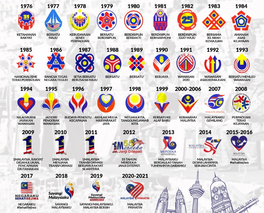
Okay, maybe except for 2012 which looked horrible too. All being said and done, given that the logo has already been unveiled through an official ceremony, I don’t think my opinion matters much though.
To be honest, it will likely grow on me anyway. Just like many other things in this blessed country that we called home.
The post This Year’s Merdeka and Malaysia Day Logo Is Clearly Based On The Wi-Fi Icon appeared first on Lowyat.NET.
0 Commentaires